
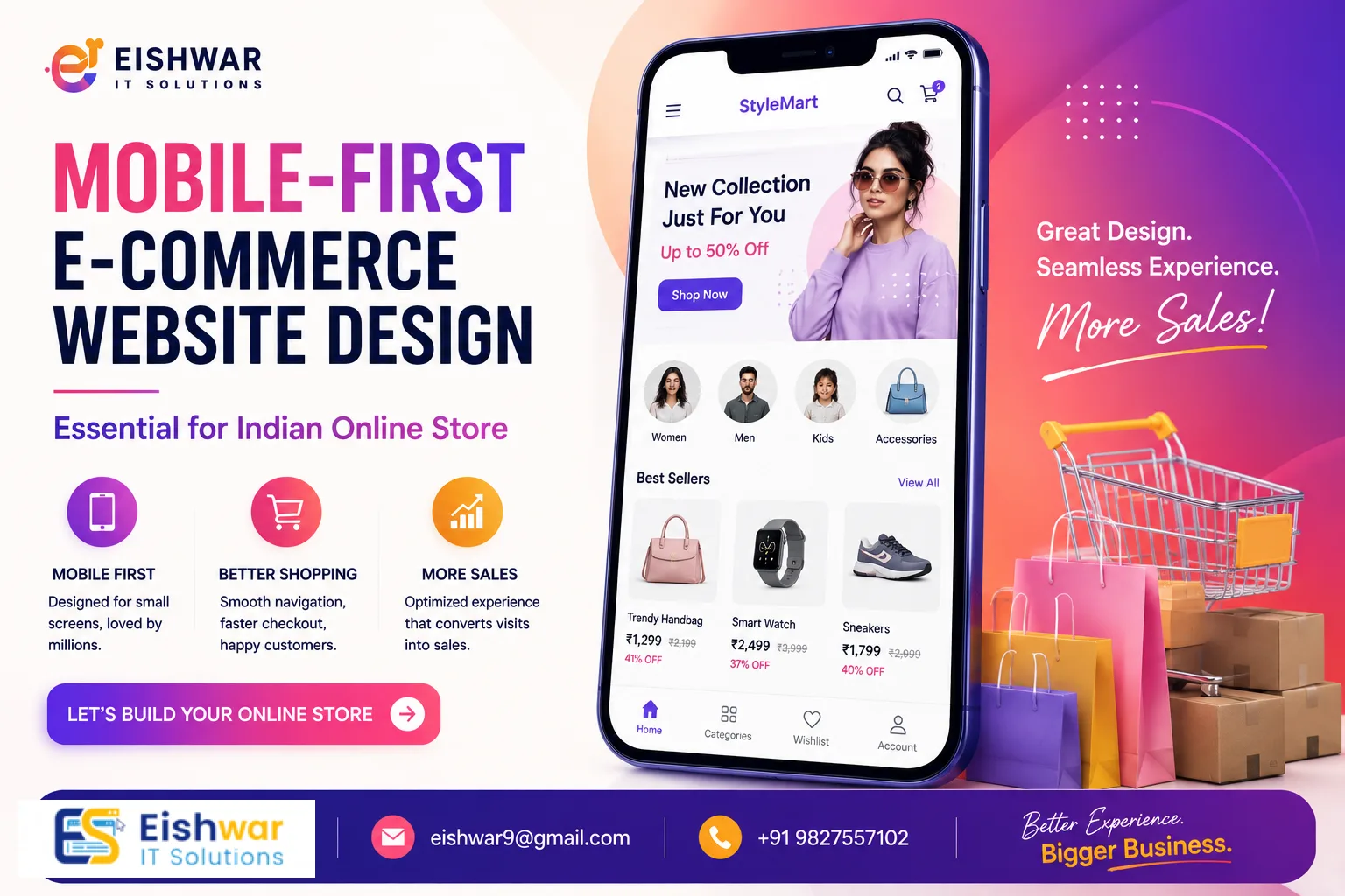
Mobile-First E-commerce Website Design: Essential for Indian Online St
Published on: 10 Jun 2026
Mobile-First E-commerce Website Design: Essential for Indian Online Stores
Introduction
India's e-commerce boom is unstoppable. With over 800 million smartphone users and affordable data plans, a massive chunk of online shopping happens on mobile devices. Yet, many business owners still design their e-commerce websites for desktops first, then try to shrink them down for mobile. That's a costly mistake.
Learn more about our Website services
In 2026, mobile-first e-commerce website design isn't just a trend—it's the baseline. If your online store isn't built for the thumb-scrolling, impatient mobile user, you're leaving money on the table. This guide will show you why mobile-first matters for Indian stores, how to implement it, and what pitfalls to avoid. Let's dive in.
Main Section 1: Why Mobile-First Design is Crucial for Indian E-commerce
The Indian Mobile Shopping Reality
India is a mobile-first nation. According to recent data, over 75% of e-commerce traffic in India comes from mobile devices. Platforms like Flipkart, Amazon India, and Meesho have optimized their entire experience for small screens. Your store must follow suit. For example, a small business in Jaipur selling handmade jewelry saw a 60% increase in mobile traffic after adopting a mobile-first approach, simply because their site loaded in under 2 seconds on 4G networks. Mobile users in India often have limited data budgets or slower connections, especially in tier-2 and tier-3 cities. A heavy, desktop-centric site can frustrate them with slow load times and tiny buttons. A mobile-first approach ensures your site loads fast, looks great, and converts visitors into buyers—even on a budget smartphone. Consider this: a study by Google found that 53% of mobile users abandon a site if it takes longer than 3 seconds to load. For Indian stores, where competition is fierce, every second counts.
User Behavior on Mobile
Mobile shoppers behave differently. They browse during commutes, while waiting in lines, or late at night in bed. They want quick product views, easy navigation, and one-click checkouts. If your site requires zooming or horizontal scrolling, they'll bounce to a competitor. Mobile-first design respects these behaviors by prioritizing speed, simplicity, and thumb-friendly interactions. For example, a clothing store in Mumbai saw a 40% increase in conversions after switching to a mobile-first layout. They simplified the product grid from 4 columns to 2, added large 'Add to Cart' buttons (at least 48px tall), and reduced checkout steps from 5 to 3. The result? Happier customers and higher revenue. Another practical tip: use 'sticky' elements like a persistent cart icon or a floating 'Buy Now' button that stays visible as users scroll. This reduces friction and encourages impulse purchases, which are common on mobile.
Main Section 2: Key Principles of Mobile-First E-commerce Website Design
1. Start with the Smallest Screen
Design for a 360px-wide screen first—this is the width of many budget Android phones in India. Then, scale up for tablets and desktops. This forces you to prioritize content and features that truly matter. Remove clutter, use clear headings, and keep calls-to-action (CTAs) prominent. For instance, on a product page, the image, price, and 'Add to Cart' button should be above the fold. Secondary details like size charts or reviews can go below. A practical example: a home decor store in Bengaluru redesigned their homepage to show only 3 featured products and a search bar on mobile, hiding the rest behind a 'View All' link. This reduced bounce rate by 25%.
👉 Don't wait for the perfect moment; turn your vision into reality today.
Free Consultation2. Optimize for Speed
Mobile users are impatient. A one-second delay can reduce conversions by 20%. Compress images using modern formats like WebP, leverage browser caching, and minimize JavaScript. Use tools like Google PageSpeed Insights to test your site. Aim for a load time under 2 seconds. For Indian stores, consider using a Content Delivery Network (CDN) with servers in Mumbai or Delhi to reduce latency. A real-world example: a grocery delivery startup in Pune reduced their homepage load time from 4.2 seconds to 1.8 seconds by lazy-loading images and deferring non-critical scripts. Their mobile conversion rate jumped from 2.1% to 3.5% within a month.
3. Thumb-Friendly Navigation
Place navigation elements within easy reach of the thumb. Use a hamburger menu, but ensure key pages (Home, Products, Cart) are accessible from a bottom navigation bar—a proven pattern used by top Indian e-commerce apps like Myntra and Flipkart. The bottom bar should have no more than 5 icons to avoid clutter. Also, make sure the search bar is easily accessible, as many Indian users rely on search to find products quickly. For example, a fashion store in Delhi added a bottom nav with Home, Categories, Cart, and Profile icons, and saw a 15% increase in pages per session on mobile.
4. Simplify Forms and Checkout
Long forms kill conversions on mobile. Use autofill, social login (e.g., Google or Facebook), and minimal fields. Offer UPI, COD, and popular payment gateways like Paytm, Google Pay, and PhonePe. A one-page checkout with progress indicators works best. For instance, a electronics store in Chennai reduced their checkout from 4 pages to 1 by combining shipping and payment details, and added a 'Save for Later' option. This cut cart abandonment by 30%. Also, consider using a guest checkout option to avoid forcing account creation.
5. Responsive Images and Typography
Use responsive images that adapt to screen size and resolution. Choose a font size of at least 16px for body text to avoid zooming. Ensure buttons have enough padding (at least 48px height) for easy tapping, with a minimum touch target of 48x48px as recommended by Google. For Indian languages, use Unicode fonts that render well on mobile. A practical tip: test your site on actual devices like a Redmi Note 10 or Samsung Galaxy M series, which are popular in India, to ensure readability and touch accuracy.
Example in Action
A Delhi-based electronics store redesigned their product page for mobile-first: they replaced a cluttered table with swipeable image carousels, added a sticky 'Buy Now' button, and used large, clear prices with a contrasting color. They also added a 'Compare' feature that worked smoothly on mobile. Their mobile conversion rate jumped from 1.2% to 3.8% in two months, and average order value increased by 12% due to better product visibility.
Main Section 3: How to Implement Mobile-First Design for Your Indian E-commerce Store
Step 1: Audit Your Current Site
Use Google's Mobile-Friendly Test and check your Core Web Vitals (LCP, FID, CLS). Identify issues like small text, touch elements too close together, or viewport problems. Document everything in a spreadsheet. For example, a store in Hyderabad found that their LCP was 4.5 seconds due to unoptimized hero images. They also discovered that their 'Add to Cart' button was only 32px tall, causing frequent mis-taps.
👉 Free Website Audit
Get Free AuditStep 2: Choose a Mobile-First Framework
If you're using a platform like Shopify, WooCommerce, or Magento, select a mobile-first theme that is lightweight and customizable. Or work with a developer to build a custom solution using frameworks like Bootstrap 5 or Tailwind CSS with a mobile-first approach. EishwarITSolution offers tailored e-commerce design services that start with mobile, ensuring your site is optimized from the ground up.
Step 3: Prioritize Content Hierarchy
Decide what matters most on each page. For product pages: images first (with swipeable gallery), then price and discount, then 'Add to Cart' and 'Buy Now' buttons. For homepages: featured products, offers, and search bar. Hide secondary content like detailed descriptions or reviews behind expandable sections (accordions) to reduce clutter. A practical example: a beauty store in Mumbai used a 'Quick View' feature on product listings that showed key details without leaving the page, improving browse-to-cart rate by 20%.
Step 4: Test with Real Users
Gather a group of Indian mobile shoppers (friends, family, or paid testers) and watch them navigate your site. Note where they hesitate, tap incorrectly, or abandon the process. Use tools like Hotjar for heatmaps and session recordings. For instance, a store in Kolkata discovered that users were tapping on a non-clickable element near the cart icon, leading to frustration. They fixed this by making the entire bottom nav bar clickable.
Step 5: Monitor and Optimize Continuously
Use analytics to track mobile bounce rates, conversion paths, and exit pages. A/B test different layouts, button colors, and checkout flows. For example, a store in Bengaluru tested two versions of their 'Add to Cart' button—one green and one orange—and found that orange increased click-throughs by 8%. Mobile-first is an ongoing process; regularly review your site's performance and user feedback.
Expert Tips
- Use AMP (Accelerated Mobile Pages) for product pages if you rely heavily on organic traffic from search. AMP can boost load speed significantly, especially for news or blog content related to your products. However, note that AMP has limitations for dynamic e-commerce features, so use it selectively.
- Leverage Progressive Web App (PWA) technology. PWAs offer app-like experiences on mobile browsers, including offline access, push notifications, and home screen installation. Many Indian e-commerce brands like Flipkart and MakeMyTrip already use PWAs. A PWA can reduce load times by up to 50% and increase engagement. For example, a small bookstore in Delhi implemented a PWA and saw a 30% increase in repeat visits.
- Optimize for voice search. Indian users increasingly use voice assistants in Hindi and regional languages like Tamil, Telugu, and Bengali. Include natural language phrases in your product descriptions, such as 'best price for rice cooker under 2000 rupees' or 'blue kurta for men'. This can improve your visibility in voice search results.
- Integrate social proof like recent purchase notifications ('5 people bought this in the last hour') and customer reviews with photos. Mobile users trust peer opinions more than desktop users, and social proof can increase conversion rates by up to 15%. Use a plugin or custom code to show real-time notifications.
- Keep your checkout to 3 steps max. Every extra step loses 10% of customers. Combine billing and shipping if possible, and offer a progress bar to show users how close they are to completion. Also, provide multiple payment options, including UPI, which is used by over 300 million Indians.
- Use lazy loading for images and videos to improve initial page load time. This is especially important for product catalogs with many images. Lazy loading can reduce page weight by up to 30%.
Common Mistakes
- Ignoring mobile load speed – Heavy images, unoptimized code, and too many scripts kill mobile experience. For example, a store in Pune used uncompressed JPEG images that were 2MB each, leading to a 6-second load time. After compressing them to WebP format (under 200KB), load time dropped to 1.5 seconds.
- Using desktop pop-ups on mobile – They're hard to close, especially on small screens, and frustrate users. Instead, use inline banners or slide-in notifications that are easy to dismiss.
- Poor touch targets – Buttons smaller than 48px cause mis-taps, leading to user frustration and abandoned carts. Ensure all interactive elements meet the minimum touch target size.
- Hiding essential info – Like shipping costs, return policy, or tax details behind multiple clicks. Mobile users want transparency upfront. Display key information near the 'Add to Cart' button or in a sticky footer.
- Not testing on actual devices – Emulators don't catch real-world issues like screen glare, touch sensitivity, or network variability. Test on popular Indian devices like Redmi, Samsung, and Vivo models.
- Overcomplicating navigation – Too many menu items or nested categories confuse mobile users. Stick to a simple hierarchy with no more than 2 levels.
Future Trends
- AI-driven personalization on mobile – Product recommendations based on real-time behavior, such as browsing history, location, and past purchases. For example, a store in Mumbai uses AI to show different homepages to users based on their weather (e.g., rain gear on rainy days).
- Augmented Reality (AR) try-ons for fashion and home decor, optimized for mobile. Indian brands like Lenskart already use AR for eyewear. AR can reduce return rates by up to 25%.
- Voice commerce – Shopping via voice assistants like Alexa, Google Assistant, and Siri. As voice search grows in India, especially in regional languages, integrating voice commands for search and checkout will become essential.
- 5G-enabled experiences – Faster speeds will allow richer mobile experiences without lag, such as high-definition product videos, live streaming of fashion shows, and real-time AR. 5G is rolling out in major Indian cities, so prepare your site for these capabilities.
- Hyperlocal mobile commerce – Stores targeting users based on location with instant delivery (e.g., within 2 hours). This trend is growing in India with services like Zepto and Blinkit. Optimize your site for location-based offers and fast checkout.
- Biometric authentication – Using fingerprint or facial recognition for faster login and payment, especially on devices with these features. This can reduce checkout time by 30%.
FAQs
- What is mobile-first e-commerce website design? It's a design approach where you create the mobile version of your site first, then enhance it for larger screens. This ensures an optimal experience for the majority of users who shop on phones, focusing on speed, simplicity, and touch-friendly interactions.
- Why is mobile-first design important for Indian e-commerce? India has a huge mobile-first user base. Over 75% of traffic comes from mobile, and many users in tier-2 and tier-3 cities rely solely on phones for internet access. A mobile-first site improves user experience, speed, and conversions, directly impacting your bottom line. For example, a store in Lucknow saw a 50% increase in sales after optimizing for mobile.
- How does mobile-first design affect SEO? Google uses mobile-first indexing, meaning it primarily crawls and ranks the mobile version of your site. A mobile-friendly site can boost your search rankings, especially for local searches like 'best saree shop near me'. Additionally, faster load times improve Core Web Vitals, which are a ranking factor.
- Can I convert my existing desktop site to mobile-first? Yes, but it's better to redesign from scratch with mobile-first principles. A responsive theme can help, but true mobile-first requires rethinking layout, content hierarchy, and navigation. For instance, a store in Chennai tried using a responsive theme but still had slow load times; a full redesign improved their mobile conversion rate by 35%.
- How much does a mobile-first e-commerce redesign cost? Costs vary based on complexity and platform. At EishwarITSolution, we offer affordable packages starting from INR 30,000 for small stores, which includes a mobile-first theme, speed optimization, and basic testing. For larger stores with custom features, costs can range from INR 50,000 to INR 2,00,000. Contact us for a custom quote.
- What are the best tools to test mobile-friendliness? Google Mobile-Friendly Test, PageSpeed Insights, BrowserStack for real device testing, Hotjar for user behavior analytics, and Lighthouse for performance audits. Also, use real devices like a Redmi Note 10 or Samsung Galaxy M32 for hands-on testing.
- How long does it take to implement mobile-first design? For a small store, it can take 2-4 weeks, including design, development, testing, and optimization. Larger stores with complex features may take 6-8 weeks. At EishwarITSolution, we provide a timeline during the initial consultation.
Conclusion
Mobile-first e-commerce website design is no longer optional for Indian online stores. It's the key to capturing the massive mobile-first audience, improving user experience, and boosting sales. By following the principles and tips in this guide, you can create a store that delights mobile shoppers and drives growth. Remember, the goal is to make shopping effortless on any device, starting with the smallest screen. Whether you're launching a new store or revamping an existing one, prioritize mobile-first. Your customers—and your revenue—will thank you. As the Indian e-commerce landscape evolves, staying ahead with mobile-first design will give you a competitive edge. Start today by auditing your site, choosing the right framework, and testing with real users. The investment will pay off in higher conversions, better SEO, and loyal customers.
👉 Free Homepage Demo
Book DemoCTA
Ready to build a mobile-first e-commerce store that converts? Contact EishwarITSolution today for a free consultation. Our expert team will design a stunning, high-performing mobile-first store tailored to your Indian audience. Let's grow your business together! Don't wait—your mobile customers are ready to shop.