
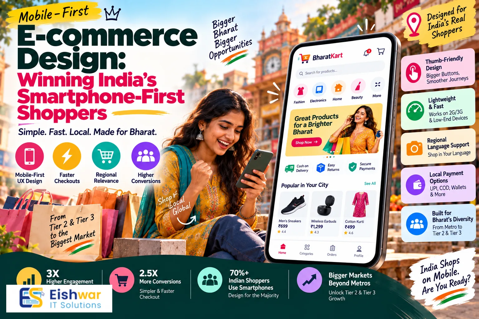
Mobile-First E-commerce Design: Winning India's Smartphone-First Shopp
Published on: 14 Aug 2026
Mobile-First E-commerce Design: Winning India's Smartphone-First Shoppers in 2026
Introduction
India is a mobile-first nation. Over 80% of internet users in India access the web through their smartphones, and that number is only climbing. For e-commerce businesses, this means one thing: your website must be designed for mobile first, not as an afterthought. In 2026, having a desktop-only or even a desktop-first website is like opening a store with the entrance blocked for most customers. This guide will walk you through why mobile-first design is non-negotiable, how to implement it effectively, and what mistakes to avoid—so you can turn your mobile traffic into loyal, paying customers.
Learn more about our Website services
Why Mobile-First Design is Non-Negotiable in India
India's digital landscape is unique. With affordable smartphones and cheap data plans, millions of users have leapfrogged desktops entirely. They shop, pay, and interact with brands exclusively on mobile. Here's why your e-commerce design must prioritize mobile:
- Mobile traffic dominance: Over 70-80% of e-commerce traffic in India comes from mobile devices. If your site isn't optimized, you're losing the majority of your potential customers. For instance, a recent study by Statista showed that mobile devices accounted for 78% of all online shopping traffic in India in 2025, and this is expected to cross 82% by 2026.
- User expectations: Indian mobile users expect fast load times, easy navigation, and a seamless checkout process. They won't wait for a slow site; they'll simply switch to a competitor. According to Google, 53% of mobile users abandon a site that takes longer than three seconds to load. In India, where network conditions can vary, this is even more critical.
- Google's mobile-first indexing: Google now uses the mobile version of your site for ranking. A poor mobile experience can hurt your search visibility. Since 2019, Google has rolled out mobile-first indexing for all new websites, and in 2021 it became the default for all sites. If your site isn't mobile-optimized, you'll rank lower, and your organic traffic will suffer.
- Rising mobile commerce: Mobile commerce (m-commerce) is growing rapidly, projected to account for over 70% of all e-commerce sales in India by 2026. Ignoring this is not an option. The convenience of shopping on the go, coupled with the proliferation of UPI payments, has made m-commerce the preferred mode for millions.
Core Principles of Mobile-First E-commerce Design
To create a winning mobile experience, focus on these core principles:
Responsive and Adaptive Layouts
Your website must look and function perfectly on all screen sizes. Responsive design ensures that your site adapts to any device, while adaptive design delivers a customized experience for specific breakpoints. In India, you'll encounter a wide range of devices, from budget Android phones to high-end iPhones. Test on multiple devices to ensure consistency. For example, a budget Android phone with a 5.5-inch screen might have different rendering than an iPhone 15 Pro Max. Use CSS media queries to adjust layouts, font sizes, and touch targets accordingly. Also, consider using flexible grid systems like Bootstrap or Foundation to streamline the process.
Speed and Performance
Mobile users are impatient. A one-second delay in load time can reduce conversions by up to 20%. Optimize images, leverage browser caching, and use a content delivery network (CDN) to ensure your site loads in under 3 seconds. Google's Core Web Vitals are critical here—focus on Largest Contentful Paint (LCP), First Input Delay (FID), and Cumulative Layout Shift (CLS). For example, you can compress images using modern formats like WebP, which are 25-35% smaller than JPEG or PNG. Lazy loading can also help by deferring off-screen images. A CDN like Cloudflare or Amazon CloudFront can serve your content from servers closer to your users, reducing latency.
👉 Don't wait for the perfect moment; turn your vision into reality today.
Free ConsultationThumb-Friendly Navigation
Design for thumbs. Place primary navigation elements, like menus and buttons, within easy reach of the thumb. Use a hamburger menu for secondary links, but keep critical actions (search, cart, menu) visible and accessible. Consider a bottom navigation bar for key actions—it's more ergonomic for mobile users. For instance, apps like Amazon and Flipkart use a bottom navigation bar with icons for Home, Categories, Cart, and Account. This pattern is now standard for mobile e-commerce. Ensure that touch targets are at least 48x48 pixels to prevent accidental taps.
Simplified Checkout Process
Long forms are a conversion killer on mobile. Implement a one-page checkout, offer guest checkout, and use autofill for address and payment details. Integrate mobile wallets like GPay, PhonePe, and Paytm, which are incredibly popular in India. Also, consider a 'Buy Now' button on product pages to skip the cart altogether. For example, Myntra offers a 'Quick Buy' option that takes users directly to checkout with pre-filled details. Additionally, use autocomplete for addresses using Google Places API to reduce typing errors. Offer multiple payment options, including UPI, which is the most popular payment method in India, accounting for over 60% of digital transactions.
Designing for Mobile-First User Experience (UX)
Beyond the basics, a great mobile UX requires attention to detail:
Visual Hierarchy and Content
Prioritize what's important. On product pages, show the product image first, then price, then 'Add to Cart'. Use high-quality images that zoom easily. Keep descriptions concise, using bullet points for key features. Avoid large blocks of text; break them into scannable sections. For example, a product page should have a clear hierarchy: product name, price, ratings, key features, and then a detailed description. Use accordion sections for 'Specifications' and 'Return Policy' to keep the page clean. Also, use high-contrast colors for the 'Add to Cart' button to make it stand out.
Search and Filtering
Mobile search should be prominent. Use a sticky search bar that's always accessible. Implement robust filtering options that work well on a small screen—use dropdowns, checkboxes, and sliders. Make sure filters are easy to apply and remove. For example, on a mobile clothing store, filters for size, color, price range, and brand should be accessible via a single 'Filter' button. Use a modal or a slide-in panel to avoid navigating away from the product list. Also, implement search suggestions and autocomplete to speed up the search process.
Product Images and Videos
Visuals are everything. Use high-resolution images that load quickly. Enable pinch-to-zoom and swipe gestures. Videos demonstrating the product can significantly boost conversions. In India, where data is cheaper, videos are becoming more popular—just ensure they're optimized to not slow down your site. For instance, you can use lazy loading for videos and provide a thumbnail with a play button. Also, consider using 360-degree product views or AR try-on features for items like eyewear or furniture, which can increase engagement and reduce returns.
👉 Free Website Audit
Get Free AuditTrust and Credibility
On mobile, trust signals are crucial. Display security badges, customer reviews, and ratings prominently. Include clear return and refund policies. Use trust seals like 'Verified by VISA' or 'Secure Payment' to reassure customers. Also, show contact information and a live chat option for immediate support. For example, a '100% Secure Payments' badge near the checkout button can reduce cart abandonment. Additionally, display 'Free Returns' and 'Cash on Delivery' options, which are popular in India, to build trust.
Mobile-First vs. Mobile-Only: The Rise of PWAs and Apps
In 2026, you have several options for mobile commerce:
- Mobile-First Website: A responsive site that prioritizes mobile. This is your baseline. It's easy to maintain and works across all devices, but it may lack some native features.
- Progressive Web App (PWA): A PWA offers an app-like experience in the browser. It loads fast, works offline, and can send push notifications. PWAs are a great way to engage users without the friction of app downloads. For example, Flipkart's PWA has seen a 70% increase in conversions and a 40% decrease in bounce rate. PWAs also take up less storage space and are always up-to-date.
- Native App: For the largest e-commerce players, a native app provides the best performance and user experience, but it requires significant investment and maintenance. In India, apps like Amazon and Flipkart dominate, but for most businesses, a PWA is a smarter investment. Native apps can leverage device features like GPS, camera, and push notifications more effectively, but they require separate development for iOS and Android, and users need to download and update them.
Consider your audience and resources. If you're a small or medium business, a mobile-first website with PWA capabilities is likely your best bet. PWAs are cost-effective and can be indexed by Google, making them SEO-friendly. They also work on any browser, eliminating the need for app store approvals.
Expert Tips for Mobile-First E-commerce Success
Here are some actionable tips from industry experts:
- Test, test, test: Use tools like Google's Mobile-Friendly Test and PageSpeed Insights. Conduct real-world testing on various devices and network speeds (2G, 3G, 4G, 5G). For example, use Chrome DevTools' device emulation to simulate different devices, but also test on actual hardware. Tools like BrowserStack allow you to test on a wide range of real devices.
- Simplify forms: Use 'tap to call' for customer service, and pre-fill information where possible. Use numeric keypads for phone numbers and credit card inputs. For instance, use the 'tel' input type for phone numbers, which brings up the numeric keypad on mobile. Also, use autocomplete attributes like 'autocomplete="name"' and 'autocomplete="address-line1"' to speed up form filling.
- Leverage voice search: With the rise of voice assistants, optimize your product descriptions for natural language queries. People often use voice search for shopping, so include long-tail keywords in your content. For example, a user might say, "Where can I buy a red saree under 2000 rupees?" Ensure your site has content that answers such queries. Use schema markup to help search engines understand your content.
- Use mobile analytics: Track user behavior on mobile specifically. Use heatmaps and session recordings to see where users tap, scroll, and drop off. This data will guide your design decisions. Tools like Hotjar or Crazy Egg can provide insights into user behavior. For instance, if you notice users are not tapping the 'Add to Cart' button, it might be too small or not visible enough.
- Offer multiple payment options: Beyond cards and wallets, consider UPI, net banking, and cash on delivery (COD). COD is still popular in India, but you can encourage prepaid orders with discounts. For example, offer a 5% discount for prepaid orders to reduce COD returns. Also, integrate 'Buy Now, Pay Later' options like Simpl or Paytm Postpaid, which are gaining traction.
Common Mistakes to Avoid in Mobile-First Design
Avoid these pitfalls that can derail your mobile e-commerce experience:
👉 Free Homepage Demo
Book Demo- Ignoring mobile-specific features: Not using click-to-call, location-based offers, or push notifications (via PWA). For example, a 'Call Now' button on a product page can help users with queries, especially for high-ticket items. Location-based offers can be sent via push notifications to users near a physical store.
- Overloading the page: Too many elements, images, or videos can slow down your site and overwhelm users. Keep it clean and focused. For instance, avoid using multiple carousels on the homepage; instead, use a single hero image with a clear CTA. Use white space effectively to guide the user's eye.
- Poorly designed CTAs: Buttons that are too small, not prominent, or hard to tap. Make CTAs big, bold, and easy to reach. Use contrasting colors and ensure they are placed within the thumb's reach. For example, the 'Add to Cart' button should be at least 48 pixels tall and placed near the bottom of the screen for easy access.
- Not optimizing for different screen sizes: Your site might look great on an iPhone but terrible on a budget Android. Use responsive design and test on a variety of devices. For example, a 5-inch Android phone might have a different aspect ratio than an iPhone, so ensure your layout adapts gracefully. Use flexible grids and media queries.
- Lack of local language support: India is multilingual. Offering your site in Hindi, Tamil, Telugu, etc., can significantly boost engagement and conversions. For example, Flipkart offers its app in multiple languages, which has helped it penetrate tier-2 and tier-3 cities. Use a language switcher and ensure that all content, including product descriptions, is translated accurately.
Future Trends in Mobile-First E-commerce Design
Looking ahead, these trends will shape mobile e-commerce in India:
- AI-Powered Personalization: AI will deliver hyper-personalized experiences based on browsing history, location, and preferences. Expect AI chatbots that handle customer service and product recommendations. For example, an AI chatbot can suggest products based on a user's past purchases and browsing behavior, increasing the likelihood of a sale. Personalization can also extend to pricing, with dynamic pricing based on user segments.
- Augmented Reality (AR): AR allows customers to 'try on' products or see how furniture looks in their home. This is becoming more accessible and will be a major differentiator. For instance, Lenskart uses AR to let users try on glasses virtually, which has increased conversions and reduced returns. AR can also be used for cosmetics, clothing, and home decor.
- Voice Commerce: With the growth of voice assistants, expect more voice-based shopping. Optimize for voice search and perhaps even enable voice-activated purchases. For example, a user could say, "Alexa, order a pack of batteries from my favorite store." Ensure your product listings are structured to be easily found by voice assistants.
- 5G and Faster Connectivity: As 5G rolls out across India, mobile experiences will become even richer. Expect more video content, immersive interactions, and faster load times. 5G can enable high-quality video streaming, AR/VR experiences, and real-time personalization. This will also make PWAs even more powerful, as they can handle more complex features.
- Social Commerce Integration: Shopping directly within social media apps like Instagram and WhatsApp will continue to grow. Ensure your mobile site is ready to integrate with these platforms. For example, you can use Instagram Shopping tags to link products directly to your site. WhatsApp Business API can be used for order updates and customer support, which is popular in India.
FAQs
1. What is mobile-first design and why is it important for e-commerce?
Mobile-first design means designing your website for mobile devices first, then scaling up to desktop. It's important because the majority of traffic comes from mobile, and Google uses mobile-first indexing for rankings. By prioritizing mobile, you ensure that the largest segment of your audience has a seamless experience, which leads to higher conversions and customer satisfaction.
2. How does mobile-first design affect SEO?
Google primarily uses the mobile version of your site for indexing and ranking. A mobile-friendly site with fast load times and good UX can improve your search rankings. Additionally, mobile-first design often includes better site structure, faster load times, and lower bounce rates, all of which are positive SEO signals. Ensure your site passes Google's mobile-friendly test and meets Core Web Vitals to maintain good rankings.
3. What are the key components of a mobile-first e-commerce site?
Key components include responsive design, fast load times, thumb-friendly navigation, simplified checkout, mobile-optimized images, and trust signals. Additionally, you should include features like a sticky search bar, bottom navigation, and mobile wallet integration to enhance the user experience. These elements work together to reduce friction and encourage conversions.
4. Should I build a mobile app or a mobile-first website?
It depends on your budget and goals. A mobile-first website or PWA is more affordable and accessible to all users. Native apps offer the best performance but are expensive to maintain. For most businesses, a PWA is a good compromise, as it provides an app-like experience without the cost of a native app. PWAs also have a wider reach, as they don't require app store downloads.
5. How can I test my website's mobile-friendliness?
Use Google's Mobile-Friendly Test, PageSpeed Insights, and test on actual devices. Also, use analytics to see how mobile users interact with your site. Tools like Google Analytics can show you mobile-specific metrics such as bounce rate, conversion rate, and average session duration. Additionally, use heatmaps and session recordings to identify UX issues.
6. What are some common mobile design mistakes?
Common mistakes include not optimizing for speed, poor navigation, small CTAs, ignoring local languages, and not simplifying the checkout process. Other mistakes include using intrusive pop-ups, not optimizing images, and failing to provide adequate touch targets. Avoid these by following best practices and continuously testing your site.
Conclusion
In 2026, mobile-first is not just a trend—it's the standard. Indian consumers are smartphone-first, and your e-commerce design must meet them where they are. By focusing on speed, UX, and simplified checkout, you can create a mobile experience that converts. Remember, mobile-first is about your customer's convenience and satisfaction. Embrace it, test it, and continuously improve. The future of e-commerce in India is mobile, and those who adapt will thrive.
CTA
Ready to transform your e-commerce website for the mobile-first era? Contact EishwarITSolution today for a free mobile UX audit. Our team of experts will help you design a mobile experience that drives sales and delights your customers. Get started now!