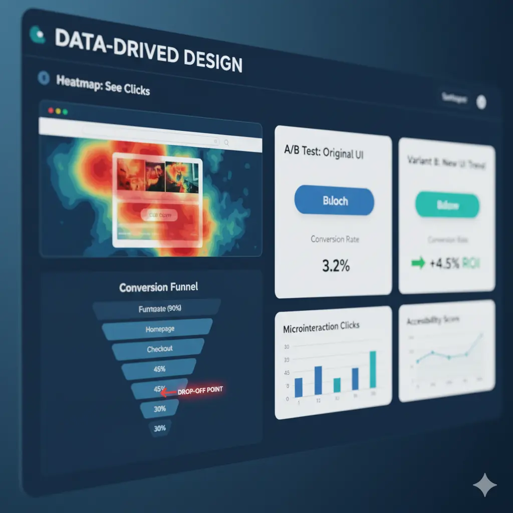
Data-Driven Design in Action: Measuring the ROI of Today's Top UX/UI Trends
Published on: 14 Nov 2025
Introduction
Hook: Your team just spent two months building a stunning new personalized dashboard. It looks incredible. The UI feels modern, the interactions are smooth, and the visuals are on point. But here’s the real question: Did it actually improve user engagement — or did you just rearrange the furniture?
Thesis: The difference between a “cost-center” design team and a “profit-center” design team comes down to one thing: measurement. Today’s UX/UI trends — personalization, accessibility, micro-interactions, or even visual styles like Neumorphism — only generate real value when their impact can be proven. This article is a practical, analytics-driven playbook for measuring the true ROI of modern UX/UI trends using user behaviour analytics (UBA).
Trend 1: Personalization & Hyper-Personalization Engines
The Trend:
Using behavioural and contextual data (location, history, preferences) to deliver customized content, recommendations, or even fully dynamic interfaces.
The Wrong Way to Measure:
“Time on site went up.”
This could mean users are confused, stuck, or hunting for what they need.
The Right Way — Analytics in Action
Method 1: A/B Testing
Compare:
Control A: Generic experience
Variant B: Personalized experience
KPIs to Track:
Conversion Rate — does personalization drive action?
Average Order Value (AOV) — are recommendations leading to bigger carts?
Task Completion Rate — can users find what they want, not what you push?
Method 2: Segmented Heatmaps
Create heatmaps for:
Logged-In Users (personalized)
New Visitors (generic)
Check:
Do personalized users click recommended items?
Or do they skip them and use the search bar?
(This signals your algorithm may be misaligned.)
Trend 2: Accessibility & Inclusive Design
The Trend:
Designing digital experiences that work for everyone (WCAG compliance, keyboard navigation, screen-reader support).
The Wrong Way to Measure:
“We passed an automated accessibility checker.”
A useful first step, but insufficient — real users don’t behave like automated scanners.
The Right Way — Analytics in Action
Method 1: Session Recordings with Filters
Filter sessions for users who navigate with the Tab key only.
Look for:
Getting stuck
Missing focus states
Excessive tabbing through navigation before reaching main content
Method 2: Form Analytics
Accessibility issues often appear as:
High form error rates
Repeated attempts to submit
Confusing labels or missing ARIA tags
Watch how screen-reader users interact.
Are error messages properly announced?
If not, accessibility is failing.
Trend 3: Micro-Interactions & “Delightful” Design
The Trend:
Small animations and feedback loops (add-to-cart effects, pull-to-refresh gestures, interactive loaders) that enhance usability or delight.
The Wrong Way to Measure:
“The team thinks it looks cool.”
The Right Way — Analytics in Action
Method 1: Click Tracking & Heatmaps
Does your new animated micro-interaction get used?
Example:
Users might ignore your fancy pull-to-refresh gesture and simply tap the refresh icon instead.
Method 2: Funnel Analysis (Perceived Performance)
A well-designed skeleton loader or animation can reduce frustration.
How to measure it:
Check drop-off rates in stages that include loading screens
A lower drop-off rate after introducing micro-interactions = improved perceived speed.
Trend 4: Neumorphism & New Visual Styles
The Trend:
Visual aesthetics like Neumorphism, Glassmorphism, and Brutalism that redefine UI look and feel.
The Wrong Way to Measure:
“Our Dribbble shot got 1,000 likes.”
The Right Way — Analytics in Action
Method 1: A/B Test (Clarity vs. Aesthetic)
Neumorphism often suffers from low contrast.
Users may not recognize buttons or interactive elements.
Compare:
Old High-Contrast UI
New Neumorphic UI
KPIs to Track:
Click-Through Rate (CTR) on critical CTAs
Time to Click — how long it takes users to act
Rage Clicks — clicking “fake buttons” created by the visual aesthetic
These metrics reveal whether aesthetics are hurting usability.
Conclusion
UX/UI trends can absolutely transform user experience — but only when they are validated with data. Analytics turns assumptions into measurable improvements and ensures every design trend delivers real business value. Choose one key user flow in your product, apply one modern UX trend, and set up a simple A/B test. Let users show you through their actions what’s working and what’s not. When design decisions are backed by behaviour data, your team shifts from guessing to delivering measurable ROI — and from a cost center to a true profit center.
